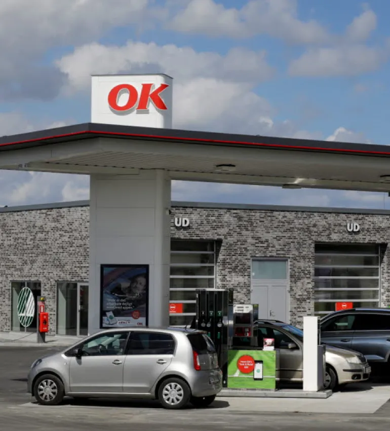
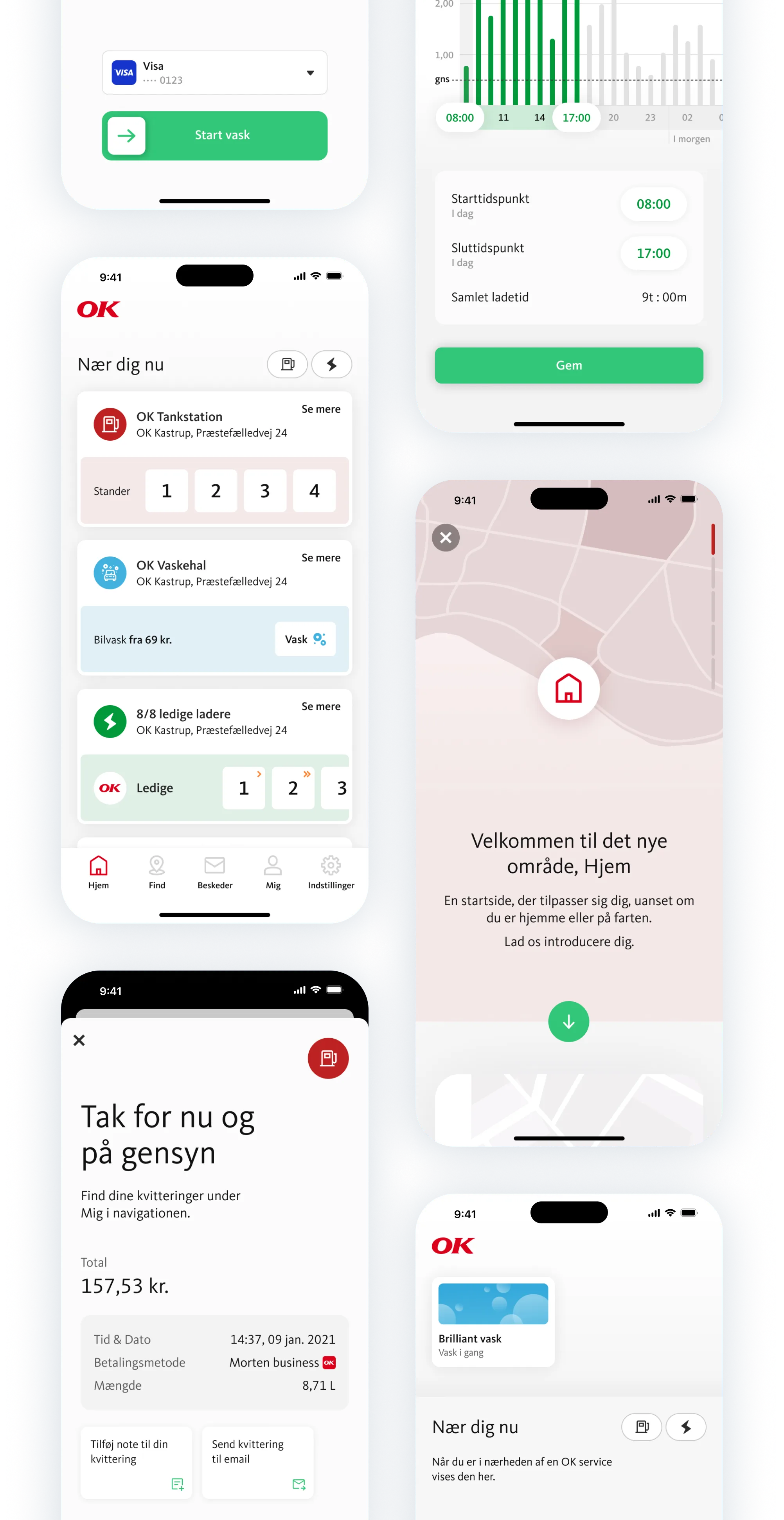
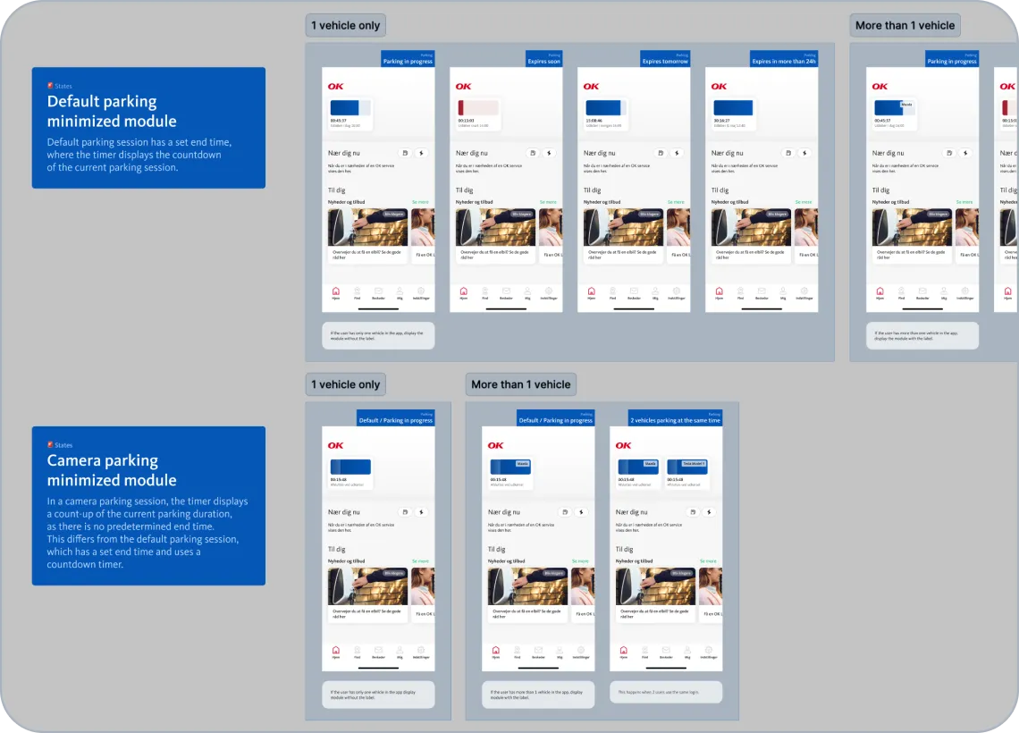
Transforming a legacy mobile app for car owners

As a UI/UX designer at Shape, I worked on redesigning OK’s utility app for iOS and Android. I led user flow design, helped modernize the legacy app by rebuilding its core flows, and created a new design system. I also improved internal processes between designers and engineers to enable smoother collaboration.

Client:OK a.m.b.a.
Timeline:2022 --- 2024
Industry:Energy
Design awards:🥇🥈🥈🥈🥉
OK app transformation

About the project

OK is one of Denmark’s largest energy companies, operating 700+ gas stations across the country. Their mobile app acts as a digital cockpit for drivers, making it easy to refuel, charge EVs, wash cars, and park without a wallet. With features like voice commands, home charging insights, CarPlay integration, and over 900,000 annual users, the app plays a key role in OK’s push for smart, sustainable mobility.

Ok app features

OK has been a long-time client at Shape, with a collaboration that spans over a decade. At the time, OK app was the studio’s largest product, and it had been on the market for several years before I joined the team. As its feature set grew, particularly with the addition of EV functionality, it became more complex and harder to manage.

With more teams and designers involved over time, the experience started to feel inconsistent and difficult to scale. I joined the team to help bring clarity, structure, and consistency to the project, drawing on my experience from similar challenges in previous work.

Project recognitions

I was part of the team behind a product that earned multiple design award nominations and wins.

Danish Digital Award

🥇Gold Customer Experience 2023
🥈Silver Best Mobile Experience 2024
🥉Bronze Best Mobile Experience 2024
Nominee Digital Transformation 2023
Nominee Commerce 2023

The Lovie Awards

🥈Silver Best User Experience 2023

E-handelsprisen Dansk Erhverv

🥈Silver Best E-Commerce app 2023

My role

Over 2.5 years, I helped transform the app’s visual design and user experience, build a scalable design system, and streamline processes to improve collaboration between designers and engineers. I joined the team as a mid-level designer, working closely with the Creative Director. While I led the hands-on design work, building flows, creating components, and organizing files, I collaborated with him to ensure consistency and align with strategic goals. He managed client communication, while I focused on day-to-day design challenges and bringing structure to the product.

Although I worked alongside another designer in the early stages, I took full ownership of the project as it progressed. Together, we created a system to support continued growth. But first, we had to untangle the mess...

Challenges

When I joined the OK team, the app had already evolved into a powerful utility with a wide range of features. But that evolution came at a cost. Years of growth, multiple contributors, and shifting priorities had left the product with overlapping patterns, inconsistent UI, and fragmented user flows. My challenge was to bring clarity, consistency, and cohesion to the experience, without interrupting active development or delaying new feature rollouts. Here’s what we were up against:

🤹 Balancing short-term fixes with long-term improvements

We were preparing for a major update while still shipping quick fixes in the legacy system. This created tension between maintaining the current app and designing for the future.

📝 Lack of documentation and clear structure

Much of the product knowledge wasn’t documented, which made it hard to onboard new team members and maintain consistency across features and flows.

💾 Legacy technology and complex infrastructure

The app relied on a complicated backend and third-party integrations, many tied to physical locations. This could make even small UX updates difficult to implement and limited our ability to innovate quickly.

🥀 Fragmented design and visual inconsistency

After years on the market, the app had evolved without a centralized design system. Each designer made small tweaks that gradually led to inconsistent styles and experiences across the app.

Building the design system

Laying the foundation

The idea of creating a design system came from our Creative Director, who brought me onto the project with this in mind. Based on my previous experience with similar challenges, he saw an opportunity for me to help bring more clarity and structure to the growing complexity of the app. The design system began as something I developed gradually alongside other tasks, fitting it in between client priorities. But it quickly became clear that we needed a shared foundation, not an overly complex framework, but a practical system that could help us stay consistent without becoming a burden to maintain.

We started with a series of internal meetings to align on what the design system should actually support. Our goal was to simplify decisions, reduce redundancies across design and code, and build a shared language between designers and developers. To better understand our starting point, I spoke with developers about their pain points and gathered their input on what would improve their workflow. I also conducted an in-depth audit of the app’s visual styles, components, and design patterns.

Example of the legacy styles & UI components: As part of my initial audit, I gathered all the existing styles and UI elements across the app. This helped highlight many similar yet slightly different styles in use.

The visual audit helped me better understand the existing design language and identify inconsistencies, along with a general lack of foundational rules. Instead of trying to build a comprehensive library from the start, I focused on creating a small, dependable set of design principles. Typography was a clear example. We had over 30 defined text styles in nearly every possible increment. I narrowed them down to a unified hierarchy with fewer sizes, consistent weights, and colors that ensured sufficient contrast.

I also introduced a 4px spacing scale to create a shared logic for spacing within components, between sections, and throughout the typography. To bring more visual consistency, I streamlined the color palette, especially the greyscales, and reduced shadows to just a few practical styles to keep elevation consistent without overcomplicating the system. These adjustments helped simplify decisions without sacrificing flexibility. In theory, the system was now ready to support the product. The next step was seeing how it would hold up in practice.

New design foundation established: While this version reflects a later stage of refinement, most of these foundations were defined early on and proved to work well in practice. A few additions were made to the color palette and typography over time as the system evolved with the product.

Making the system work

I started building the design system much later than when I first established the foundational rules. Client priorities had shifted, and we spent a lot of time working on concepts and planning the app’s future direction before returning to system work. A major turning point came with the introduction of the new home tab. This update marked the biggest structural shift in the app’s history. Alongside a new navigation model, we began modernizing the legacy UI and finally had a solid use case to start applying the design system in practice.

To structure the system, I followed the Atomic Design methodology (introduced by Brad Frost). It helped me break down the interface into clear, manageable layers such as atoms, molecules, and organisms, which made it easier to stay consistent and avoid duplications. I began with a minimal set of tokens and foundational rules, including spacing, grid, color palette, shadow styles, and typography hierarchy. From the start, I kept naming conventions simple and scalable. For instance, shadows followed a T-shirt sizing model: small, medium, and large, each representing a different elevation level. Starting small gave the system room to grow without becoming overly complex.

Atoms are basic building blocks like colors, labels, and icons. Molecules combine atoms into functional components. Organisms group molecules to form distinct sections. Templates structure organisms into page layouts. Pages bring templates to life with real content.

As the product evolved, I added components, re-evaluated early decisions, and refined the rules based on real usage and feedback. I also started documenting the purpose and usage of each component to avoid overlapping patterns and inconsistencies. Since the system was built alongside the redesign of core flows, it wasn’t a separate initiative. It was tested and validated in real time. This iterative approach ensured the system stayed practical, flexible, and grounded in actual product needs.

A snapshot of core UI components and interaction patterns used in the OK app. It documents common elements like cards, buttons, form fields, and navigation icons, organized by their function and behavior.

Design isn’t just the interface

As we built out the new home tab and restructured core flows, I also focused on improving our internal design practices, from file organization to handover standards and documentation. These efforts evolved through trial and error, gradually refining what worked and discarding what didn’t. When I first joined the project, the handover process was limited to meetings, with little to no documentation. This meant that knowledge was siloed among individuals, making it difficult for others to fully understand the logic behind certain features or design decisions.

For instance, understanding the functionality of a specific flow often relied on direct communication with the person who designed it, which created bottlenecks and made collaboration harder. I introduced structured documentation and proposed a more transparent workflow. While the idea was initially met with hesitation, seen as extra work, it quickly proved valuable. As the product scaled and more people joined the team, having a written record of decisions, logic, and flows helped us stay aligned and reduced the risk of misinterpreting work months down the line.

One key improvement was establishing a clear visual structure in design files. Previously, screens were placed side by side without much context, making it hard to distinguish between core flows, variants, or edge cases. I introduced a new system where the primary flow was shown first, clean and without any error states or overlays, followed by separate sections for additional screens, variants, and UI states. This made files easier to navigate, improved consistency, and helped both designers and developers understand the broader context more easily.

Component behaviour in a specific feature

Documentation of how the system communicates activity in progress, and outlines how parking modules behave in different contexts; such as default vs. camera parking, or when multiple vehicles are registered. It highlights conditional logic, visual states, and layout variations based on user data.

Shared behavior across components

Documentation of how the app communicates active states like refueling or charging, how vehicle selection logic works, and how map interactions behave across the app. These patterns help ensure a consistent and intuitive experience throughout.

Login & sign up flow

A reusable template showing the logic used across the app. This documentation helped maintain consistency as the same pattern was implemented in multiple features throughout the Figma file.

Putting puzzles together

Over time, all the scattered pieces began to come together. What once felt like a fragmented and chaotic system slowly turned into a cohesive toolkit that supported our daily work. With a shared structure in place, I could build new flows and wireframes in just a few hours. This was something that would have taken days before. The mental workload had shifted. I no longer spent energy debating button sizes, spacing, or choosing between near-identical shades of gray. Instead, I could focus on what really mattered: solving complex problems, improving the user experience, and thinking more strategically about the product.

Of course, the work didn’t stop there. A design system was never a final deliverable. It remained a living, evolving foundation. As new features were added and the product continued to grow, the system adapted. But with solid groundwork in place, the team was in a much better position to move forward with clarity, consistency, and confidence.

Design system impact

🙌 Improved team collaboration

Gave designers and developers a shared foundation, making communication smoother and reducing back-and-forth.

🏎️ Faster design and development

Helped the team move quicker, speeding up testing and rollouts, and reducing the need to design or code from scratch.

🧹 Easier maintenance

Made it simpler to remove outdated designs and clean up legacy code, helping avoid technical and design debt.

👓 Improved accessibility

Replaced low-contrast greys and tiny text with darker, readable colors, better sizing, and consistent weights that meet contrast standards.

🎨 Consistent look and feel

Brought clarity to the interface with unified components, layouts, and rules that scaled across the app.

📉 Lower development costs

Cut down on time spent fixing inconsistencies or redoing work, allowing the team to focus on improving features and exploring new ideas.

🌸 Better user experience

Created a cleaner, more predictable interface that’s easier to use and builds trust over time.

📱Built on native standards

Replaced customized components with native equivalents, making the app more intuitive by supporting built-in platform behaviors like gestures and transitions.

Major app updates

A new Home for the app

The introduction of the new home tab marked a major turning point in the app’s evolution. It was more than just a visual refresh; it became the foundation for a broader shift in how users navigate and interact with the app. Previously, users would land directly on the map, where a station card would automatically open and cover the entire screen. As the number of EV stations grew, this interaction became frustrating and disruptive. The new home tab replaced that experience with a personalized dashboard showing nearby services like fuel, EV charging, and car wash. It offered a clearer, more seamless overview without interrupting the flow, ultimately giving users a better starting point for their journey.

This update marked the biggest structural shift in the app’s history. It touched nearly every part of the product, from navigation to visual identity. What I worked on was a version one: a careful blend of old and new. While we introduced updated visuals and restructured major parts of the app, we intentionally kept some legacy design elements in place to avoid overwhelming users with too much change at once. It was a balancing act between modernization and familiarity. Given the scale of the update, we prioritized what mattered most for this release and planned to continue refining the experience in future iterations.

Designing user onboarding for a smoother introduction

With the launch of the new home tab, I designed an onboarding flow to help users understand the update without interrupting their experience. It required no input or decisions, just a short, focused walkthrough explaining the new features and layout.

It appeared the first time users opened the app after the update, guiding them through the changes. After that, it remained accessible within the home tab, where users could revisit the walkthrough or dismiss the module completely.

Creating a page template for user-guides

As part of this work, the onboarding to home tab became a template we reused across other parts of the app, creating a consistent and familiar onboarding pattern. I also introduced a new illustration style. I created simplified visuals that reflected key parts of the interface, highlighting what mattered most while stripping away unnecessary detail.

The illustrations remained grounded in the real product but had a subtle abstract quality that helped keep the focus on understanding rather than decoration. We also introduced animation to bring the onboarding to life, making it feel smoother, more engaging, and easier to follow.

Modernizing the core purchase flows

This update didn’t live in isolation. It touched nearly every part of the product. As we restructured the home screen, we also began modernizing the app’s UI and revisiting core purchase flows that drive the most value for users and the business. This became a foundational moment for aligning structure, experience, and visual identity into something more cohesive. The core flows include EV charging (both public and home), fuel for personal and commercial vehicles, car washes, and parking. Each service has its own nuances, from subscription-based car washes to timer or camera-based parking.

We streamlined all these experiences into a consistent step-by-step pattern: selection (such as charger, pump, or parking spot), payment, in-progress activity, and finally a receipt screen. This created predictability across the app and made it easier to onboard users to new features.

While the overall structure remained the same, some flows included additional steps to make the experience more digestible and easier to follow. Parking and washing, for instance, required a few more steps to account for their specific logic and use cases. Beyond that, most services had flow variants tailored to user data and specific needs; such as entering mileage for business use, applying gift cards, managing subscriptions, or receiving guided steps for special wash rooms like drive-through car washes. Some EV stations also required unique user permissions; for example, hotel guests could scan a QR code to charge their vehicles for free through the app.

Beyond visual alignment, the redesign focused heavily on clarity. For example, the car wash flow, which had the most steps and required users to follow specific safety instructions, was restructured to guide people through the process more intuitively, especially since users are allowed to remain inside the car only when using the app. While we refreshed the UI throughout the flows, we also chose to retain some familiar elements like square selection buttons for pumps and chargers. This helped us roll out changes gradually without overwhelming users or developers.

Before & after: Car wash flow redesign -- The updated flow breaks the experience into clearer steps and adds helpful instructions like “First drive into the wash hall, then swipe to start,” which addresses real-world confusion uncovered during testing.

Before & after: Parking flow redesign -- The updated flow separates information into a selection screen and a checkout screen, replacing the previous single-screen layout, making the process easier to follow and helps users focus on one decision at a time.

Station cards variants
These cards adapt to the service and context. Content, buttons, and badges update based on availability, location rules, and the user’s needs. For example, a fuel card shows available pumps, an EV card includes details like connector speed and guest-only locations, and a home charger card offers scheduling options. All variants follow the same design rules to keep the experience consistent, with service-specific colors to differentiate them.

Designing user onboarding patterns

When I joined the project, the app had little to no real onboarding. The few guides that existed were basic and didn’t match the quality we wanted the product to reflect. We saw an opportunity to not only improve clarity but also make the experience feel more thoughtful and engaging. I designed two onboarding patterns, each serving a different purpose:

Guided onboarding

The first was a scroll-based guide with a vertical progress bar, used to explain features without requiring any user input. These acted as quick, engaging walkthroughs with light animations, designed to educate without disrupting the experience.

Productive onboarding

The second was a step-based onboarding with a horizontal progress bar, used when user input was essential, such as adding a payment method or registering a vehicle. These tasks were critical, as some services could not function without them. For example, parking requires a license plate to avoid fees.

We also introduced contextual prompts to encourage setup at the right moments. If a user had no nearby services, a module would appear suggesting they add their vehicle or payment details from the comfort of home. This way, onboarding felt relevant and timely rather than a barrier to getting started.

Payment & Vehicle setup logic diagram

A detailed process flow mapping all possible pathways and screen variations for payment and vehicle setup. I created this diagram to align designers and developers on the logic behind different scenarios, such as whether the user is logged in, has a saved payment method, or needs to register a vehicle. It helped resolve recurring issues around payment option selection and ensured that every variant was accounted for before development.

Other design work

Live activity & Dynamic island

In addition to redesigning the core experience and building the design system, I also worked on smaller but meaningful features that improved usability and added value for users.

One of these was a Live Activity and Dynamic Island integration for parking. These features allow users to track their active parking session in real time without opening the app.

The Live Activity displays remaining time on the lock screen, while the Dynamic Island provides a subtle, persistent view with quick access to extend the session.

This helps users avoid potential parking fines and provides a more convenient way to manage time-sensitive tasks on the go.

Closing thoughts & My takeaways

This project pushed me in ways no other had before. It tested my limits both creatively and organizationally, and helped me grow into a more confident and capable product designer. Working on such a complex native app taught me the importance of structure, clarity, and scalable thinking, while still leaving room for flexibility and creative problem-solving.

One of the biggest lessons I took from this experience was learning how to balance consistency with adaptability, and the importance of knowing the rules so I can break them with intention. A design system should not be a creative jail, but rather a framework that frees up mental space to focus on meaningful decisions, not pixel-level inconsistencies.

There is a lot more I contributed to that I cannot share publicly due to confidentiality, but I would be happy to dive into those details in person. I'm excited to see how the app continues to grow and evolve, and I'm proud to have played a part in shaping a more cohesive and thoughtful experience.

Keep exploring

Responsive design system for a multi-brand platform

I helped design a scalable e-commerce platform for ROCKWOOL, making ordering, multi-brand management, and logistics more efficient.

Read case study
project-card-rockwool

Rebranding a sustainable nordic retail brand

From a school assignment to Suztain’s new visual identity, now showcased across their packaging, both online and in physical stores like the Danish variety chain Normal.

Read case study
project-card-suztain

Corporate identity system for tech start-up

A comprehensive corporate identity for Whyser, a female-led tech startup. From defining brand voice to creating its visual identity, helping the brand connect with its audience.

Read case study
project-card-whyser
Copied!