A bachelor thesis project for Whyser, a female-led tech startup. The
concept defines a modern and approachable brand persona and a visual
identity designed to reflect it, parts of which were later implemented
by the company.
Client: Whyser
Timeline: Sep 2020 -- Jan 2021
Industry: SaaS
About the project
As part of my bachelor thesis, I developed a comprehensive corporate
identity for Whyser, a tech startup offering an online
SaaS platform that helps leaders collaborate with their
teams on business strategies. Working closely with the company’s
founders, I crafted Whyser’s brand persona as an approachable, modern,
and human identity, and designed a visual identity system that reflects
this character. By defining the brand’s voice and visual language, the
goal was to create an authentic, inclusive, and
consistent experience across all touchpoints.
The concept was partially implemented by the company, showcasing its
real-world relevance and impact. This project received significant
attention online, becoming one of my most well-received case
studies, with over 500 likes and 12,000 views on Behance, and led to
several inquiries for similar work.
Shaping identity system
Defining the brand, Values, & Tone of voice
Whyser is a SaaS platform designed to help leaders in mid-sized
companies craft, plan, and manage business strategies
collaboratively with their teams. As a female-ledcompany, Whyser
challenges the stereotype of traditional,
male-dominated tech brands by embracing a down-to-earth,
human-centered approach. Building on this foundation, I developed a
brand concept that embodies a modern, fresh, and
approachable personality.
If Whyser were a person, she would be a confident yet approachable
woman in her forties, someone who is fun, friendly, and
professional. She values clear and persuasive communication, avoids
unnecessary jargon, and fosters an inclusive environment where
everyone feels valued.
Whyser’s tone of voice is open, authentic, and engaging,
deliberately
moving away from a stiff corporate tone to create a
genuine connection with its audience. This distinctive
personality positions Whyser as relatable, quirky, and human,
setting it apart in the competitive tech industry.
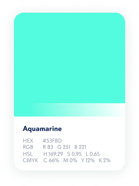
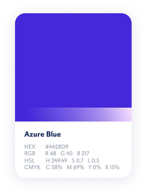
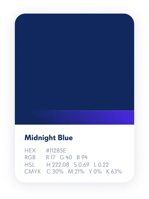
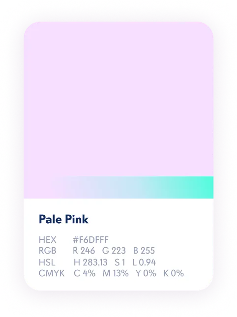
Color palette
The color palette was designed to reflect the brand’s modern,
dynamic, and approachable personality while making it
memorable and visually striking. The bright color
spectrum aligns with the dynamic nature of the tech industry, making
the brand feel more contemporary and relevant in a crowded market.
Gradients, a key feature of the brand’s visual style,
bring movement and depth, adding an
extra dimension to both
imagery and typography. However, they’re used sparingly to
ensure they don’t detract from the clarity of the overall design.
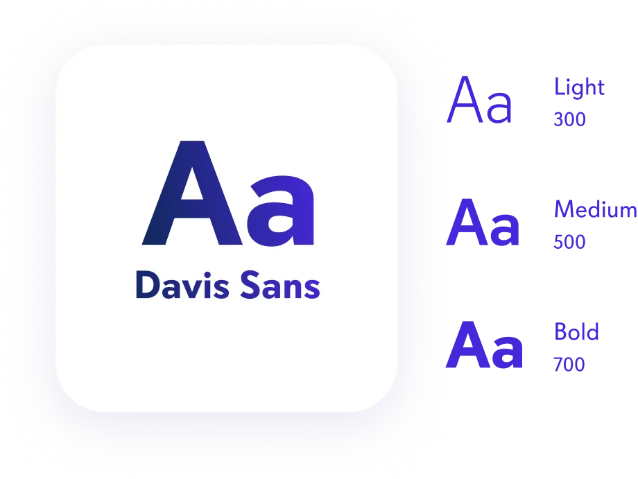
Typography
Typeface Davis Sans, a modern and clean sans-serif
font chosen for its readability and versatility across both
web and print materials. Its simple yet contemporary design
perfectly aligns with the brand’s modern and approachable
personality.
Logo design
Whyser’s logo is the core expression of the brand identity,
consisting of alogomarkandwordmark. The primary logo is used across most touchpoints to
maintain consistency and brand recognition. In cases of limited
space or when the brand name is already displayed, the secondary
logo (the logomark alone) is used for a more streamlined appearance.
Iconography
Our iconography is designed to align seamlessly with our typography,
enhancing brand recognition. Icons feature
curved edges with bold outlines, creating a cohesive visual
language. A combination ofgradientsandsolidcolors from our palette adds depth and vibrancy,
ensuring icons are distinctive, modern, and instantly recognizable.
Photography & Illustration
Photography aims to evoke an authentic connection with the audience
by capturing real moments with real people. The tone is warm,
inviting, and emotive,
making viewers feel like natural witnesses to the scene.
Images are selected to be genuine and relatable,
reinforcing the brand’s human-centered values.
To create a friendly and distinctive feel, photographs are framed
with both rounded and sharp edges. Photography is
often paired with simplified software illustrations,highlighting specific featuresto reinforce the message. Illustration serves as a creative
tool to express abstract concepts and platform features in a direct,
clear manner, complementing the photographic style and providing
flexibility in storytelling.
Shapes
The use of blurry gradient blobsin the background adds
an organic and dynamic feel to the layouts, creating
visual interest and depth. These elements enhance the
overall design, giving it a modern, fluid quality.
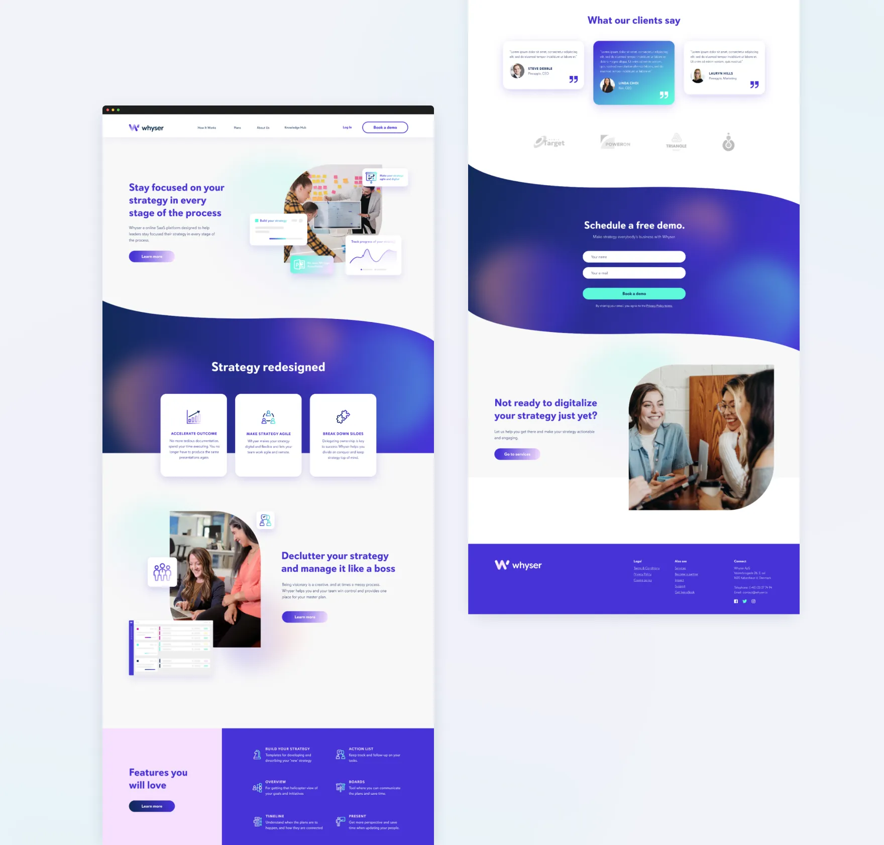
Creating digital experience
Website design
The brand elements seamlessly come together on the landing page,
creating a cohesive and engaging experience that tells the
brand’s story while establishing a distinctive and
memorable identity.
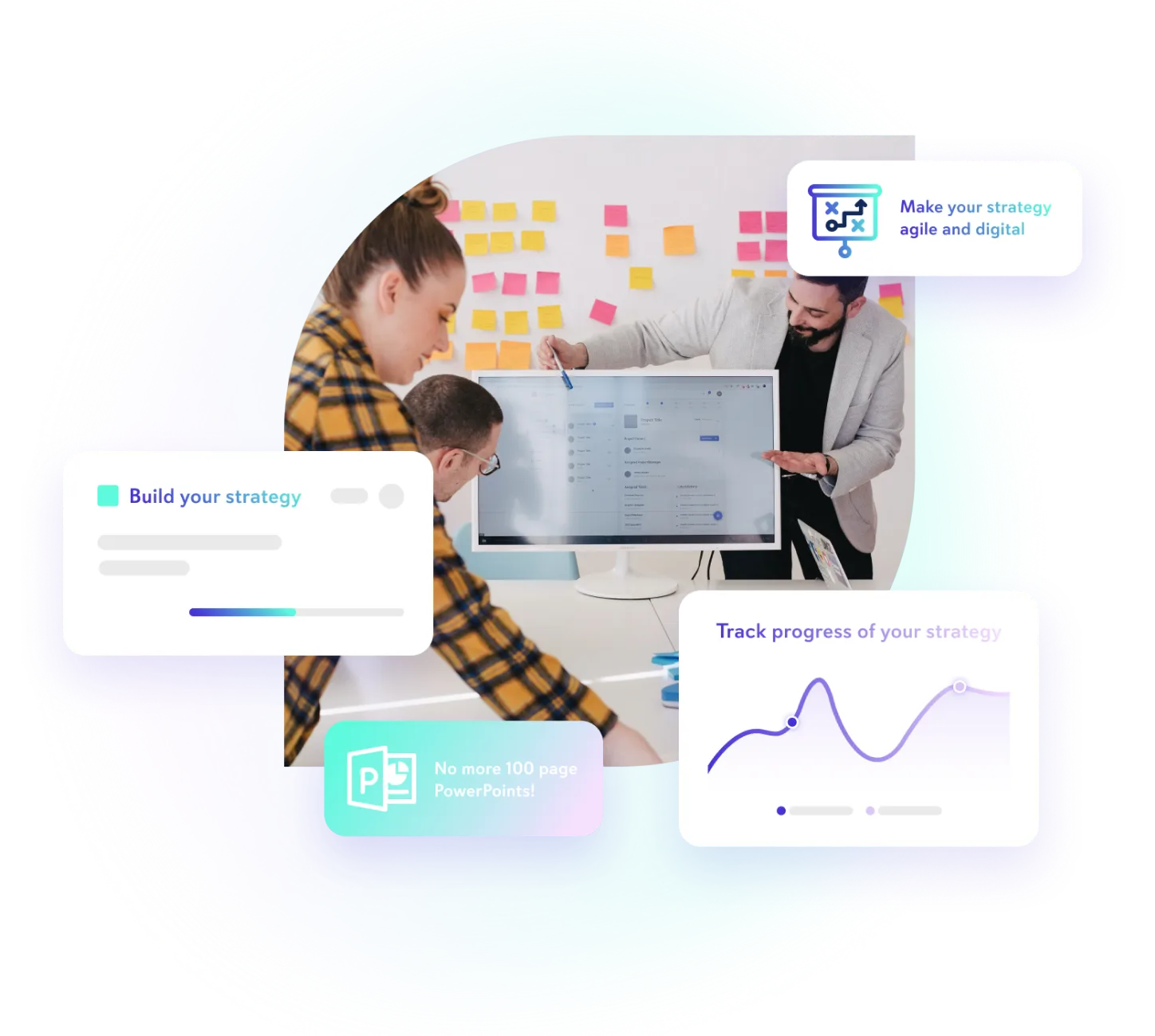
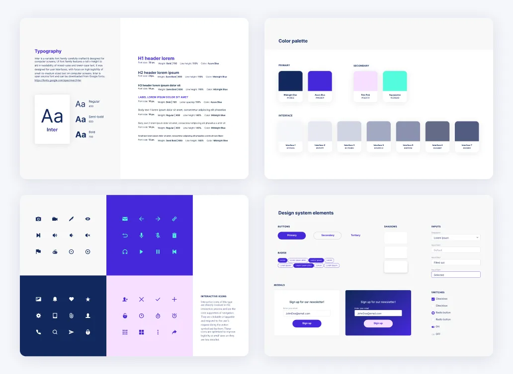
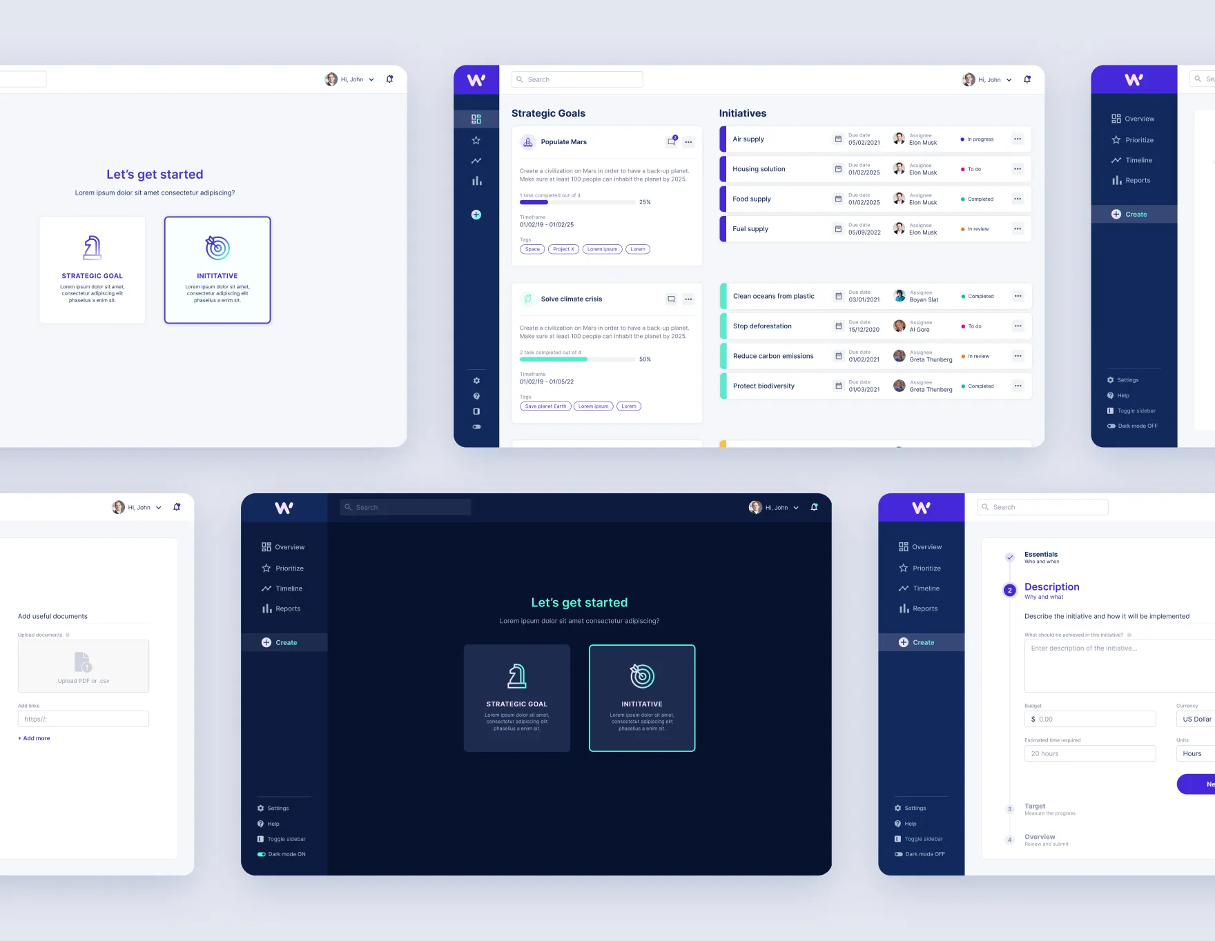
Software application
In designing the software application, the visual identity was
adapted to complement the platform’s primary function as a
productivity tool while staying true to the brand’s distinctive
personality.
The design strikes a balance between the brand’s bold, dynamic
elements and a more toned-down approach, reflecting the
focus onfunctionality and usability.
The goal was to create a visually engaging experience that aligns with
Whyser’s modern and approachable identity without overwhelming the
user. To enhance clarity and user experience, Inter, a legible font
family designed for screen use, was selected for the interface. The
color palette follows the brand guidelines
with adjustments made for the interface, incorporating new
grayscale colors for balance and structure. This
ensures the software remains both user-friendly and visually cohesive.
Additionally, two themes, light mode and dark mode, were
designed to offer flexibility and optimize the user experience in
different environments, while still reflecting the core visual
direction and personality of the brand. This approach creates a
seamless integration of brand identity and user interface, maintaining
a balance betweenvisual appeal and
functionality.
A project that resonated
This case study on
Behance
has been one of my most well-received projects, garnering over 500 likes
and nearly 12,000 views. The positive response from the design community
and the inquiries I received about identity design were incredibly
rewarding, though I had to turn down opportunities at the time due to
full-time commitments. This success was a great affirmation of the
approach I took with the project.