Rebranding Suztain, a sustainable retailer in Denmark, to better
reflect its mission and connect with its target audience. I developed
a new visual identity inspired by nature, femininity, and Nordic
minimalism. The concept was later implemented by the company across
packaging and their website.
Client: Suztain
Timeline: Oct 2019 -- Dec 2019
Industry: Sustainable products retail
About the project
Suztain, approached our school to gather branding ideas from a class
of over 50 students. As a real client, they reviewed our
proposals and selected my concept for implementation. I
developed a new visual direction inspired by natural elements and
Scandinavian minimalism, aiming to reflect the brand’s values and
connect with their target audience.
Alongside the design, I conducted a business analysis that
offered fresh insights, which the company found valuable.
Suztain later implemented the visual identity independently, and it
now appears across their packaging, both online and in
physical stores like the Danish variety chainNormal.
Challenges
Suztain’s existing brand lacked a cohesive visual identity that
could communicate its values clearly and consistently across
platforms. The previous logo and website design felt outdated and
didn’t reflect the modern, conscious lifestyle Suztain promotes. The
challenge was to bringclarity, warmth, and
credibilityto the brand through a fresh, unified visual
direction that could elevate their presence both online and on
physical products.
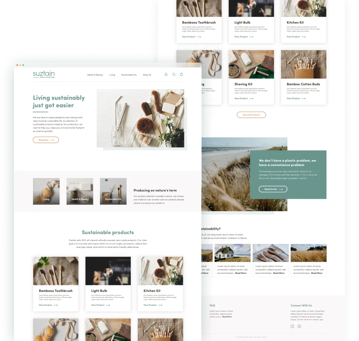
Suztain’s original website and logo before the redesign
Building the brand
Brand strategy & Visual direction
Suztain is a brand committed to inspiring individuals to
take small steps toward a more sustainable lifestyle.
They aim to make eco-friendly choices easier by offering a range of
sustainable products, from everyday home goods to personal care items,
all crafted through fair production processes and using
environmentally friendly materials.
The brand
targets young, environmentally aware women living in Denmark,
who are motivated to make a positive impact on the planet. To resonate
with this audience, Suztain’s new visual identity draws inspiration
from natural and feminineelements, infused with
a Scandinavian aesthetic to create a warm, modern, and
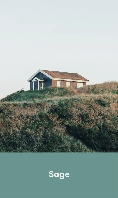
trustworthy brand presence. Grounded in earthy tones and imagery
inspired by Nordic landscapes, the design aims to foster
authenticity, emotional connection, and alignment with the everyday
lives of Suztain’s audience.
Color palette
The color palette is inspired by nature, featuring
muted shades that evoke harmony, femininity, and
sustainability. Green, as the primary color, symbolizes
nature and safety, while yellow and beige serve as complementary
tones. Dark brown is used for typography, grounding the design in
warmth and readability.
Tints of these colors are applied to backgrounds and design
elements, maintaining the brand's organic and
balanced feel while reinforcing its commitment to
environmental values.
Typography
Typography plays a key role in reinforcing the brand’s
modern, feminine vibe. The clean, round forms of the
Sofia Pro typeface offer clarity and
ease of readability, ensuring a harmonious and accessible user
experience across both print and web platforms.
Logo design
Suztain’s primary logo consists of a wordmark, brandmark, and
tagline. The wordmark features clean, rounded typography that
reflects the brand’s approachable and
modern personality.
The brandmark incorporates a leaf detail with visible
veins, symbolizing growth, nature, and sustainability.
The tagline, “take a small step” encapsulates Suztain’s
mission to inspire people to embrace a more sustainable lifestyle
through small yet impactful actions.
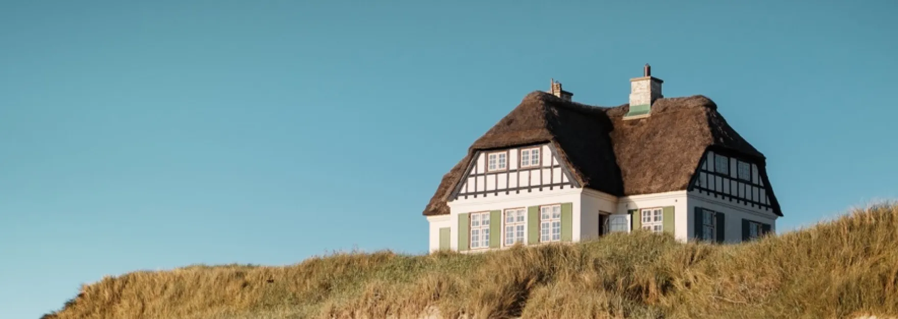
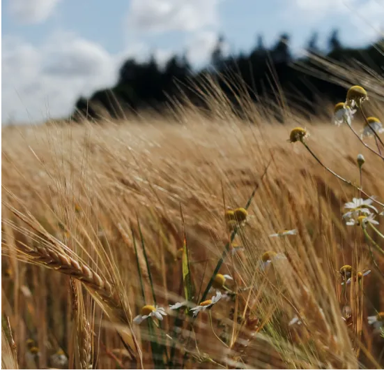
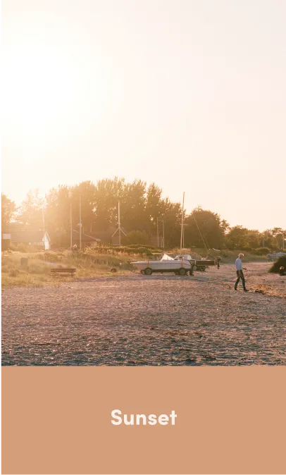
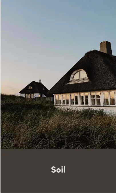
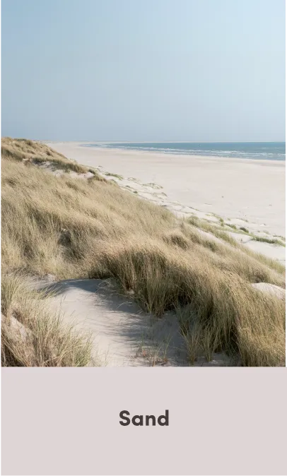
Photography
To ensure authenticity and a
deeper connection with the target audience, the brand's
imagery is rooted in Nordic landscapes. Photography captures
the natural beauty of the countryside, highlighting the environment
Suztain’s consumers live in. By using imagery of these landscapes,
we align the brand with theeveryday livesof our audience, enabling them to imagine themselves using
Suztain products in their own environments.
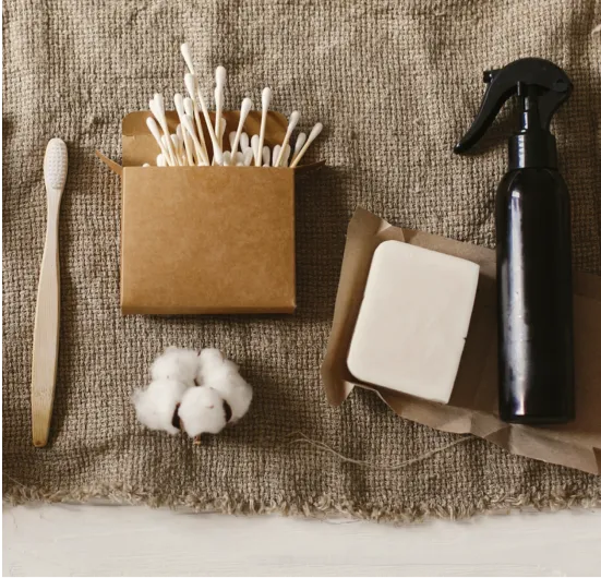
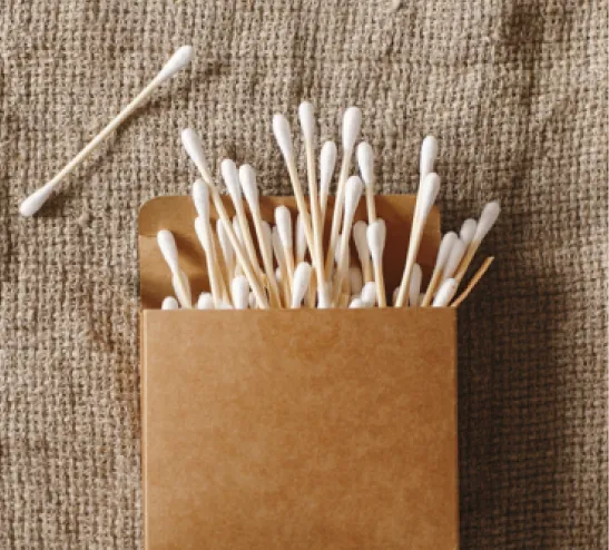
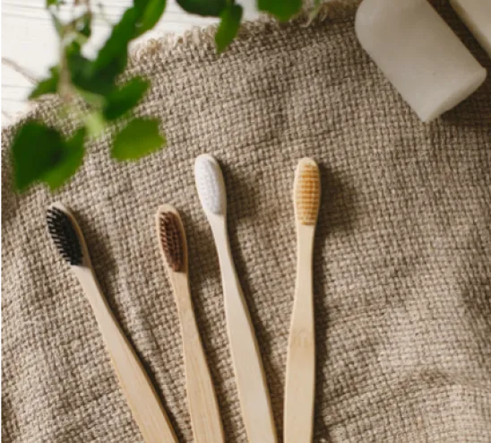
Product photography moves away from traditional, sterile white
backgrounds. Instead,
products are photographed in natural settings or through
thoughtfully designed in-house setups, featuring
natural patterns and textures. This approach not only
reflects the quality and authenticity of the products but also
creates a compelling visual narrative that enhances the overall
brand experience.
Brand guidelines
I created a comprehensive guide to
help the client apply visual identityconsistently and
effectively. The guidelines include detailed instructions,
examples of best practices, and clear visuals demonstrating how to use
key elements such as the logo, color palette, typography, imagery and
tone of voice. To ensure clarity, the guide also highlights common
mistakes to avoid, making it easier for the client to maintain a
cohesive brand presence across all platforms.
Website design
I’ve incorporated the visual direction I developed for Suztain into
a concept design for a landing page.
Muted tones, white space, and
minimalistic elements create a clean, modern look.
Warm, earthy accents add an inviting touch, while the Scandinavian
aesthetic ensures balance and simplicity.
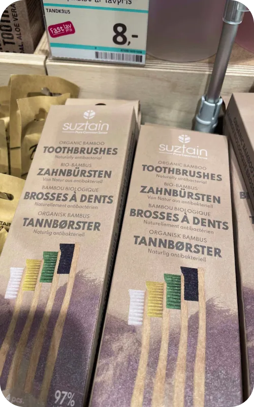
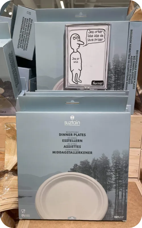
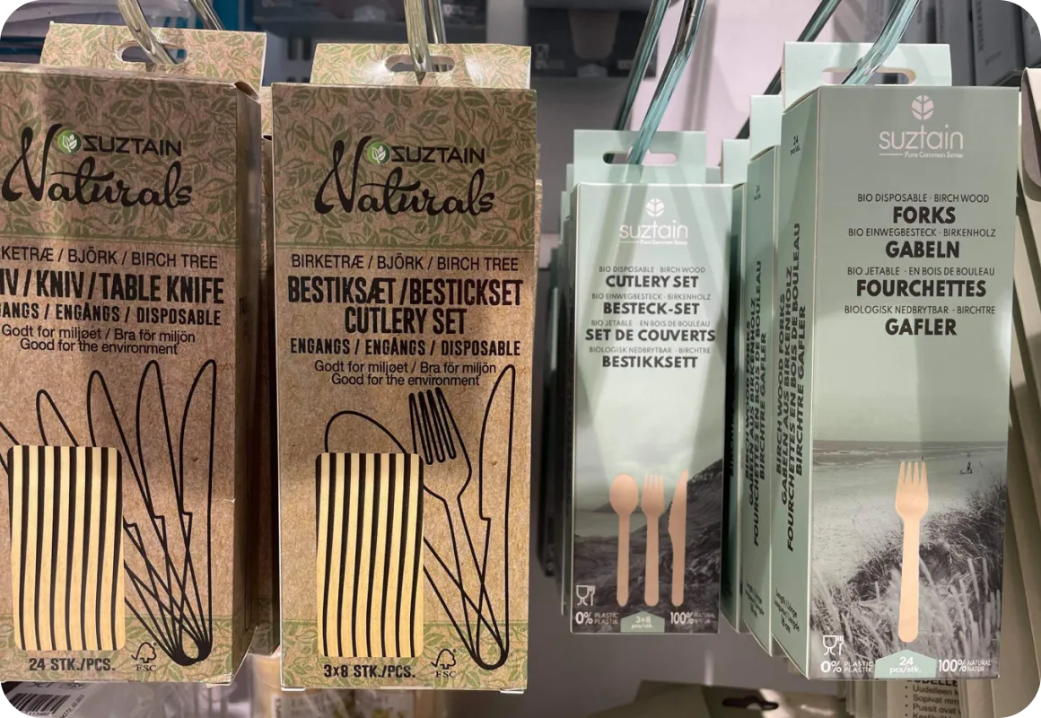
The design living in the real world
Suztain, selected my design concept and strategy for implementation,
recognizing how I successfully captured their vision and brand
essence. Although I was offered financial compensation and a role at
the company to support the implementation of the rebrand, I had to
decline due to my commitment to a design studio at the time. Suztain
later implemented the design independently, and today, their products
featuring the new visual identity can be found online and in Danish
variety store Normal.
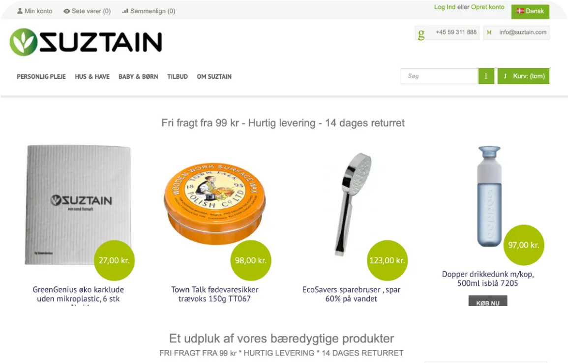
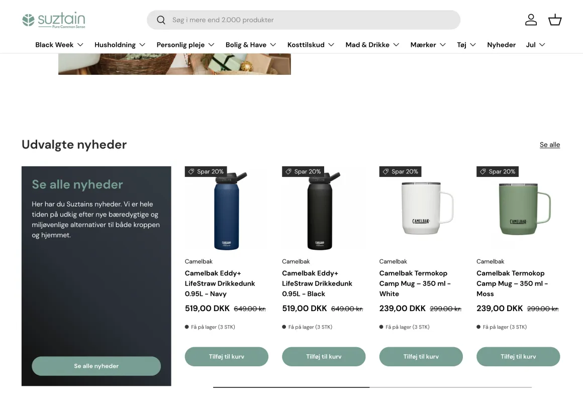
The company’s website has been refreshed to align with the new
brand guidelines
Products in Danish variety store Normal
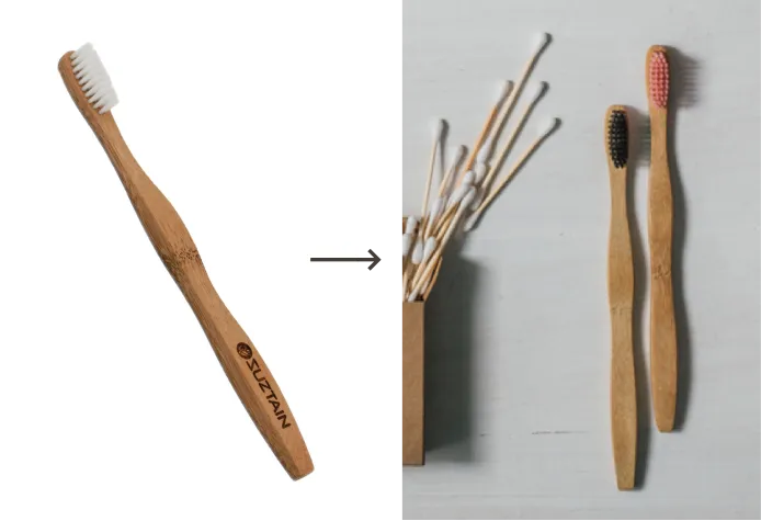
Products with old packing (left) and updated packaging (right)